The fellow who bought the ukulele I made and donated to the Baily Mathews National Seashell Museum was intending to give it to his grandson. However, he started to play around/play it and now does not want to give it up. (By the way, the sound and tone of this instrument, the first one I have made with a cypress top, is really good.) Anyway, he contacted me thinking about getting another instrument for his grandson, perhaps something with his grandson’s name inlayed on it.
It just so happens that of the most recently completed set of 6, two of them had dark rosewood headplates that would be great for additional inlay. It is much easier to inlay into a dark wood as any filler around the inlay blends in much more easily, and the dark color really makes the pearl ‘pop’. I could do the inlay on the headplate, and then re-finish just the headplate pretty easily. He decided on one of the two instruments, and then I proceeded as follows.
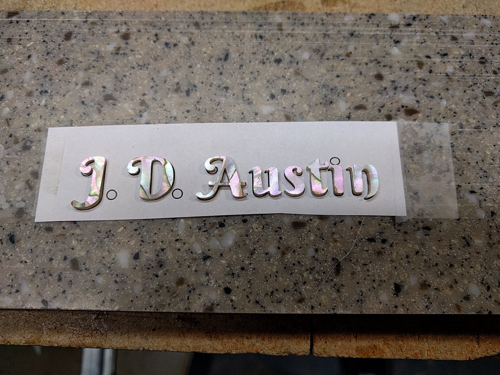
I have found a very handy internet site that will produce a stencil outline of entered text, in a wide variety of fonts. I can then take that font image (as a bitmap), put it into Corel Draw and convert it to a vector outline format which allows easy and accurate scaling and line thickness changes. So this is what we decided on:

The only change I made to the above was to move the to leading initials closer together. Doing this made the overall string shorter, which means I could make the letters a bit bigger and still fit them on the headstock.
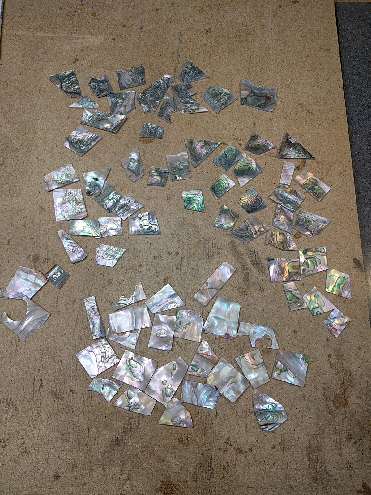
The next step is to pick out what pearl is going to be used. This instrument has a red abalone rosette, so I decided to match that on the headstock. Also, the pink color of the pearl would go well with the color of the rosewood. I have a pretty big supply of red abalone pearl which I cut from shells. (You can see the process back on page 7 of this blog, from Feb 11, 2018) Red abalone can be either pinker or greener, and I wanted pearl without a lot of ‘texture’ lines since the letters are not that big, and I think lines/texture would distract. Also, these texture lines tend to be points of weakness, and some of the letters have some pretty thin areas. So I got out the box of red abalone pearl slabs, and sorted it by color and texture
To cut the inlay, I print out the text and then stick the paper onto the pearl with rubber cement. To get the placement of the text on the pearl right, I first position the text where I want it, then tape down one side. This gives me a little hinge, so I can rubber cement the paper and pearl, let it dry, and then close the hinge to stick the paper down in exactly the right spot.

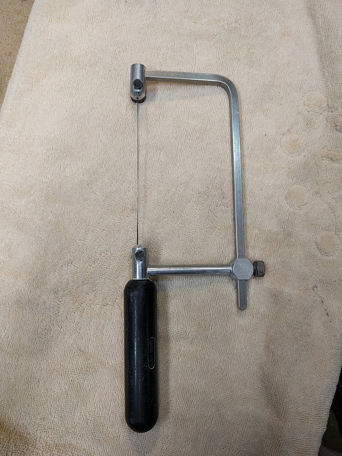
The pearl is cut with a jewelers saw and a fine jewelers blade. The blades range from pretty fine to really really fine where you can only just barely see the teeth. The blades wear pretty quickly cutting the somewhat abrasive pearl (they are designed to cut metal) and you break a lot of them, but they are not that expensive. For these letters I used a moderately fine blade, since some of the letters have fine detail serifs. As you are cutting you want to go in an order such that you cut the fine delicate detail last to avoid breaking it off handling things while cutting other sides.
Text is interesting in that as readers we are very sensitive to how the letters appear across the ‘page’. Font designers go to great lengths to make things look right, and the human eye will pick up little inconsistencies. Because of this I want to make sure that the letters get inlayed aligned exactly correctly. My solution: when the letters are cut out I glue them down onto their image on a piece of paper with small drops of water soluble kids glue.
Then I take a small stick, and glue that onto the top of the letters, which are now held in exactly the correct places, with the same kids glue.

Putting the paper side down on a wet sponge releases the paper without dissolving the glue on the stick, so I get all the letters attached to the stick. Then I can put this down on the headstock and trace around the letters with a .3 mm pencil, to give me lines to cut out the inlay pockets.
Note: I looked at the above picture, and the leading “J” looked like it was tilted a bit off vertical. Was it just the camera angle? I checked the placement of the letters against a printed version, and sure enough the “J” had been glued down just a hair off vertical. Only a fraction of a millimeter off, but the eye picks this up. Text is an interesting thing as it relates to human perception. I corrected the position of the “J” on the stick.
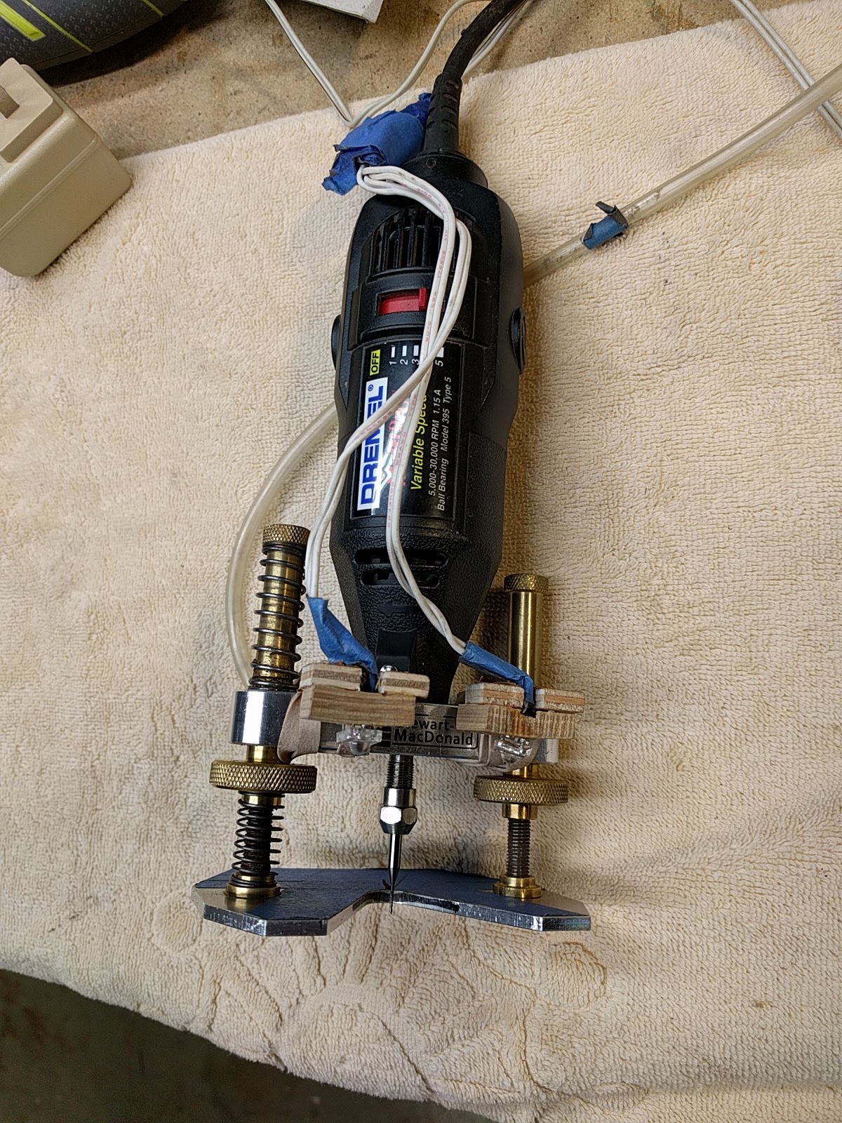
To cut the inlay pockets I use a Dremmel router base from Stewart Mac-Donald to which I have added a couple of little LED lights for better illumination. Not pretty but works well. I cut the pockets with a fine carbide bit. You have to go slowly so as to not break the fine bit, but rosewood cuts much more easily than ebony. One thing I use which I highly recommend is a foot switch to turn the tool on and off. I can start and stop the router with my foot, without having to take my hands off of the router. When you are cutting a narrow area, and want to move the router, being able to pause, hold the tool steady, and turn it off with the foot is very safe and convenient.
Once all the pockets are marked I soak the stick & letters in water a bit to release the kids glue, and then inlay each letter individually. The pockets are cut out depth-wise so the letters are just a hair above the surface of the headstock, the letters are put in place, and small gaps are filled with some rosewood sawdust, and then the whole thing is flooded with thin CA glue to glue it all down. Looks pretty ugly at this point.
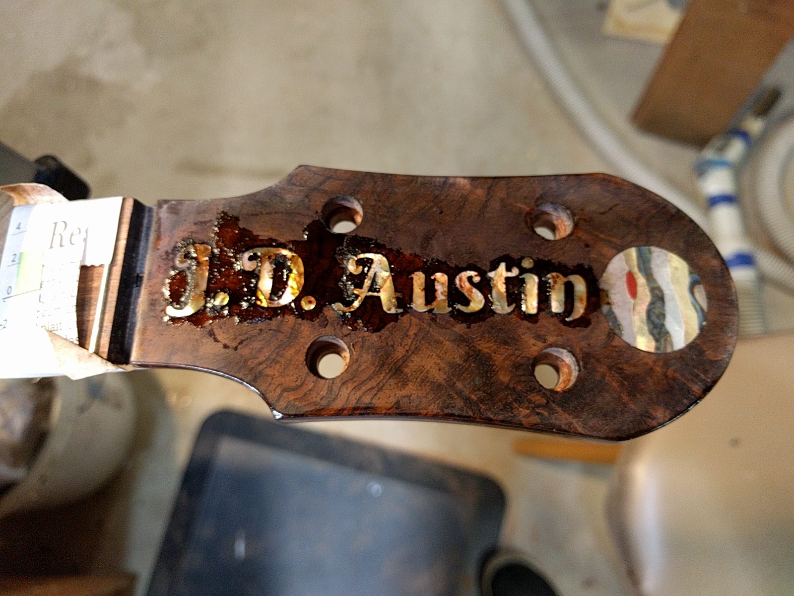
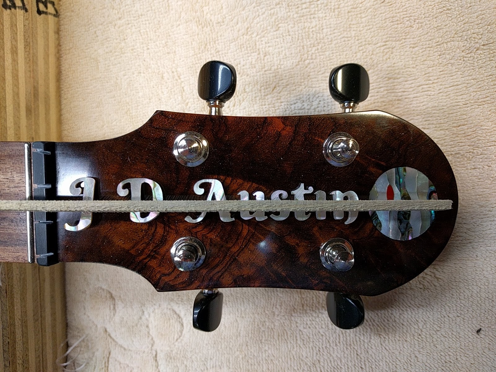
Then you sand off the surface, cutting down through the CA glue, and the pearl that is above the headplate, to reveal (this is always a fun part) the final inlay.
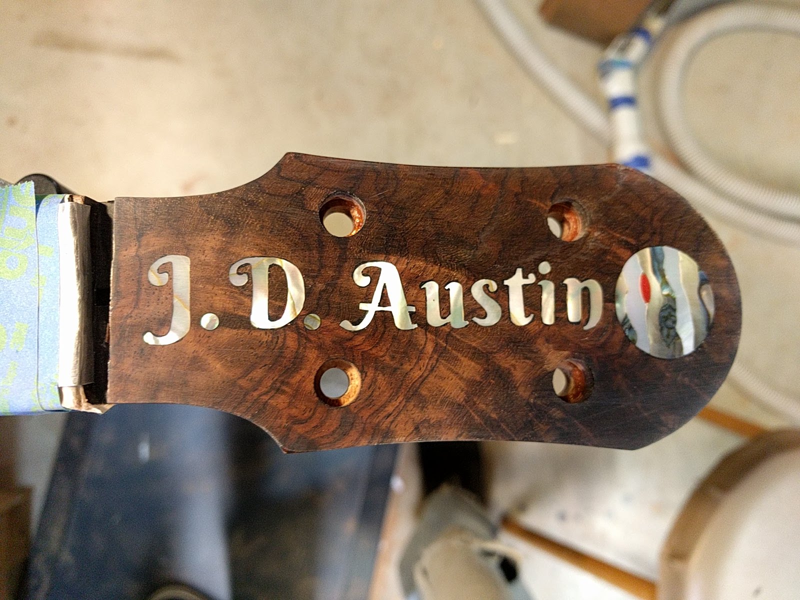
Now I just need to re-finish the headstock. Hard if not impossible to take a picture that conveys the iridescence of the pearl. The pink color of the pearl came out looking really nice against the rosewood.